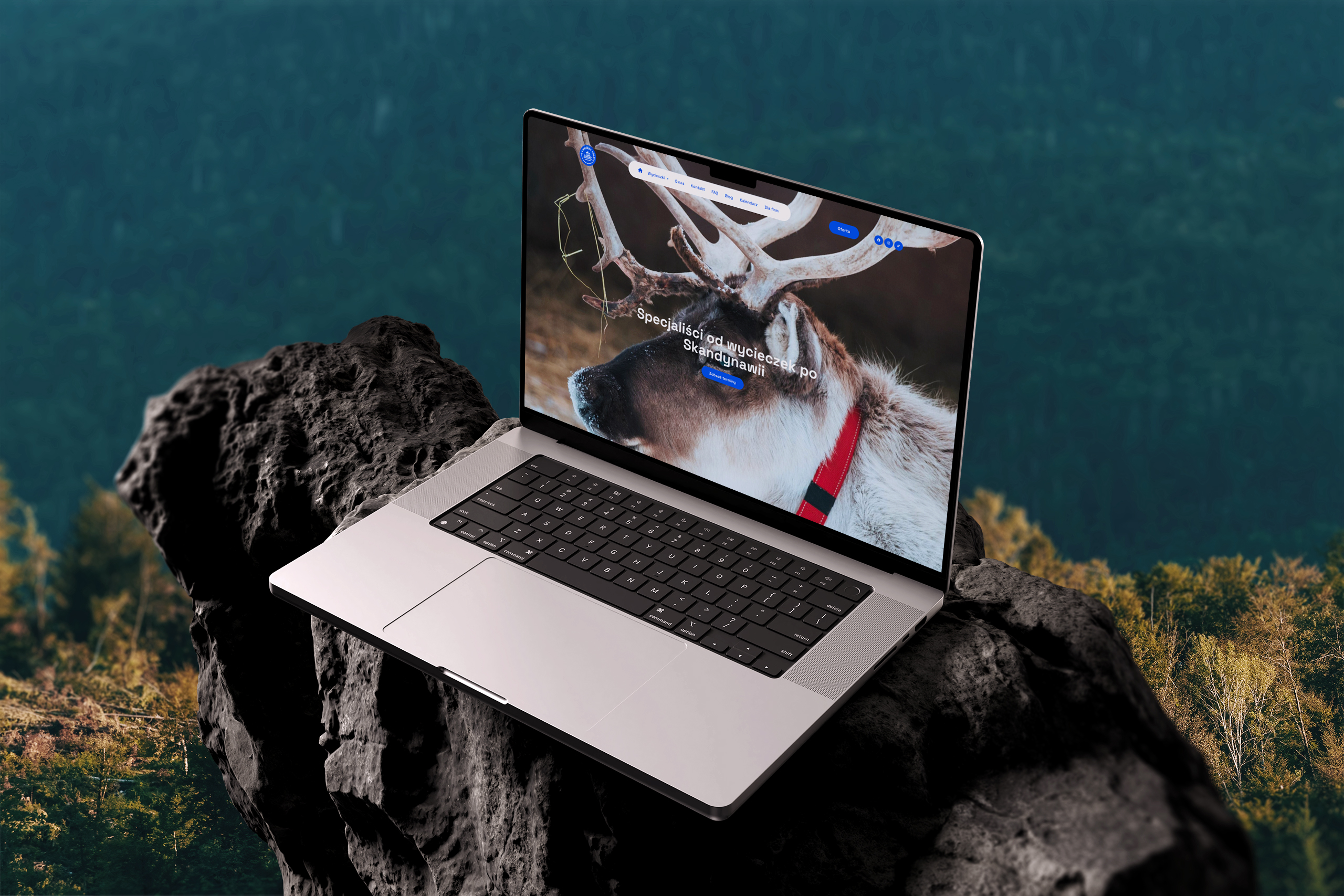
The new website gives Kierunek Północ a dedicated, on-brand basecamp for all their adventures. A custom layout based on their visual identity brings in the calm, raw atmosphere of the North, while trip pages highlight the most beautiful locations, programs and logistics in a clear, intuitive way. Dates, availability and key details are easy to scan, so every link they share – from social media or email – now lands people in one place that does the explaining and nudges them towards joining the next journey.
„I found Karolina and Tomasz through their portfolio. I had seen their beautiful websites created for other entrepreneurs and dreamed of having something equally special for myself. They helped me many times in difficult situations, answered hundreds of questions, replied to tricky emails, and were always there to support me.
They created a stunning website for my business, which has been praised by users. They are open to feedback (and I consider myself a demanding client  ), and they always either implement suggestions or explain when something isn’t the right choice.
I’m absolutely thrilled and can recommend them 100% with a clear conscience. When it comes to websites – it’s Karolina and Tomasz all the way!”